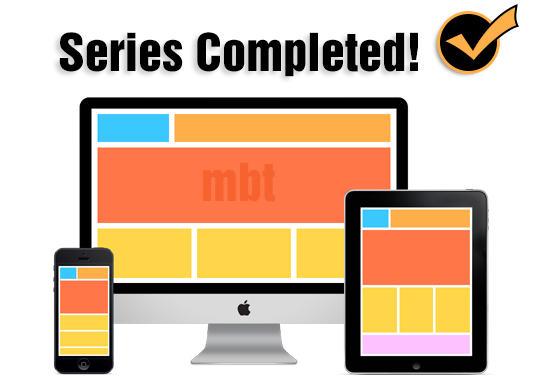
Why bother creating a responsive design?
Google recently rolled out a Mobile Friendly update on April 21, 2015, which boosts the ranking of mobile-friendly sites on mobile search results. Google no longer favors fixed width layouts and recommends that all sites must provide better touch experience, where text should be readable without tapping or zooming, tap targets are spaced appropriately and the page avoids unplayable content or horizontal scrolling.
Running out of time? Let's read a brief summary to each part.
Here we demonstrated what exactly are responsive designs and how they are created using CSS3 @media screen queries. Normally mobile browsers emulates a desktop view by squeezing big resolutions into small screens that is often difficult to read and browse. You must be familiar that how difficult it is to click a web link in iphone unless you zoom it.
Therefore we make sure all elements on the site from buttons, links and images/media provide a better touch experience. To make them look big and clean with clear resolution all that needs to be done is to add Meta Viewport tag in the page header and some CSS3 Media queries that does all the job.
Breakpoints are points at which your layout design breaks or crashes. Breakpoints are CSS3 Media Queries that tells the browser which Layout to load for your website based on the screen size (viewport). It controls the display of your user interface (UI) on mobile devices.
With so many Mobile Products in market where each smartphone or tablet has a different Screen size, it is important that we select some Content Specific Breakpoints so that your blogspot page may adjust and fit perfectly to the different screen sizes and may not looked squeezed or poor in resolution
Surprisingly blogger templates supports a rarely used mobile conditional expression i.e. isMobileRequest which is a Globally Available Data which can be applied to any HTML DOM inside the template. isMobileRequest is a Boolean Data Type that accepts only two values which is either True or False. It can be used to show or hide HTML content or widgets containers in smartphone devices. It currently does not support Tablets or iPads etc. but you can surely use it to prevent rendering of unnecessary widgets and scripts on mobile devices to speed up your page load time on small screen devices.
This tag also helps you to avoid using CSS Display:none to hide content on your site which is not a SEO friendly approach to responsive designs. Thus it is really a time saving condition that gives you more control and power over the blog content that loads in mobile phones.
The fundamental part of a responsive design is the structure of its Header which includes your blog logo and navigation menu. This tutorial shares an easy to use responsive drop down menu with a search functionality. This menu can be displayed on both PC Desktop screens and smartphones and tablets. You can also choose to maintain your current desktop menu and instead chose to use this responsive menu for mobile screens only. A simple fix to the most important component of your mobile layout.
Ever wondered how to make your blog images to auto adjust their dimensions in mobile phones and tablets without effecting its resolution and quality? Images with large sizes often don't fit in small screen devices and as a result gives a bad UI impression. Images must be fluid in its behavior, their width and height dimensions should be stylized such that they may instantly change their overall size as the browser screen goes smaller or bigger.
Our approach is based on CSS @media Queries unlike adaptive image methods which makes use of JavaScript of php.
Since we have learned the core basics, now its time to start customizing different sections of your blog and make them auto adapt to mobile screens. This tutorial in chunk discusses ways to mobilize the 4 important sections of your blog which are:
- Header
- Content area
- Sidebar
- Footer
Need Help?
I hope this short summary of different parts of this major and longest tutorial will help you take a helicopter view of every tools and methods required to customize your beautiful blogs into a mobile supported layout that may better help your readers to browse and read your articles. Thus giving you the advantage of both pageviews and search ranking. Let us know if you need any help and I would love to answer all your queries. Peace and blessings buddies! =)


0 comments:
Post a Comment