TOTAL VISITS

Sunday 31 May 2015

Create Shortcode For Responsive HTML Tables!


HTML Table ShortcodeAn HTML Table is the most important part of a webpage design that helps you organize content in rows and columns. If you have large HTML Tables then they can barely fit in small Mobile screens and if you try to squeeze it up, the tables either crash or becomes unreadable. Today we will help you create dynamic and Fancy Mobile Responsive HTML Tables using Shortcodes that are naturally fluid and responsive by nature. Instead of squeezing the Table we will let your mobile readers to horizontally scroll Table data using their Thumbs. Responsive Tables are touch sensitive and they can be scrolled to left or right, thus making your content both viewable and readable. All these thanks to Blogger Shortcode Plugin that helps you create amazing design tools with a simple one line code!


You will be able to insert HTML Tables inside your Blog Posts, widgets and guess what? You can even add Tables inside your blogger comments!


What is HTML Table Shortcode?


The table shortcode is a simple textual shortcut code that lets you create fancy Tables without using complex HTML. You can create tables directly from your Blogger Editor composer without needing to switch to the HTML mode.

You all know that a table consists of three important elements which are:


Element Definition
Row In HTML syntax we call it the <tr> tag but in our Shortcode we renamed it as [row]
Column In HTML DOM it is known as <td> which is the data container or data cell. You can insert text, images, lists, other tables or shortcodes here etc. In our shortcode we simplified it to [col]
Heading This tag is written as <th> In our shortcode you will call it [heading] which sounds much more readable.


Instead of using a complex ugly HTML code to design a table you can use a human readable shortcode that does wonders. Our Shortcode is not platform dependent. You can use it anywhere you like, may it be Wordpress, Joomla, Drupal, Blogger or a simple Static HTML webpage. It works great everywhere.


For The Record


So far this is the first Shortcode for HTML tables that does not uses the complex method of passing data as a long sequential array.  Instead you will construct the layout for your HTML Table using rows and columns to clearly organize data. Lets create one instantly!


1. Install Blogger Shortcode Plugin


In order to use Table shortcode you must first install the shortcode plugin for your blogspot blog by following 7 easy steps shared in the link below:


Skip installing it if you have already added it in your blogger template


2. Add Color Themes


We have created 4 Color Themes.


  1. theme1 - Default Black

  2. theme2 - Blue

  3. theme3 - Green

  4. theme4 - Red


Add them to your templates by following these steps:


1 Go To Blogger > Template > Backup your Template


2 Click "Edit HTML"


3 Search for this code ]]></b:skin>


4 Paste the following Code just above it


/*----------HTML Table Shortcode--------*/


#theme1, #theme2,#theme3,#theme4{width:100%;font-family:sans-serif,arial; block;border-spacing: 0;}


#theme1, #theme2,#theme3,#theme4,#theme1 th, #theme2 th,#theme3 th,#theme4 th,#theme1 td, #theme2 td,#theme3 td,#theme4 td{border:1px solid #ddd;border-collapse:collapse}


#theme1 td, #theme2 td,#theme3 td,#theme4 td{padding:10px}


#theme1 th, #theme2 th,#theme3 th,#theme4 th{padding:12px 10px;text-align:left;font-family:oswald;font-weight:400; font-size: 17px;}


#theme1 tr:nth-child(odd){background-color:#f1f1f1}


#theme1 tr:nth-child(even),#theme2 tr:nth-child(even),#theme3 tr:nth-child(even),#theme4 tr:nth-child(even){background-color:#fff}


#theme1 th{background-color:#333;color:#fff;border:1px solid #333}


#theme1 th:nth-child(even){background-color:#555}

/*Blue*/


#theme2 tr:nth-child(odd){background-color:#d3ecf2}


#theme2 th{background-color:#42b0c9;color:#fff;border:1px solid #42b0c9}


#theme2 th:nth-child(even){background-color:#4bbad3}


/*Green*/


#theme3 tr:nth-child(odd){background-color:#e2f2d3}


#theme3 th{background-color:#a3e264;color:#fff;border:1px solid #a3e264}


#theme3 th:nth-child(even){background-color:#85c942}


/*Red*/


#theme4 tr:nth-child(odd){background-color:#efddda;}


#theme4 th{background-color:#ef4832;color:#fff;border:1px solid #ef4832}


#theme4 th:nth-child(even){background-color:#de1f05}

@media only screen and (max-width:768px) {#theme1,#theme2,#theme3,#theme4 {overflow-x: auto;display: block;}}


5 Save your template and all done!


Finally Create HTML Table Shortcode


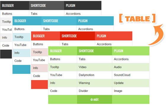
HTML Table Layout


  • The above image shows a Responsive Table with 7 Rows and 3 Columns.

  • Where each row contains three columns.

  • Columns are vertical and Rows are horizontal.


Headings are created using the following shortcode


[heading]Title[/heading]

Data inside table cells is inserted using the following shortcode


[col]Cell[/col]

FULL CODE

Now when you wish to add a Table inside your blog post, you will add the full shortcode in this format.


[table color="theme3"] 

[row] [heading]Title 1[/heading] [heading]Title 2[/heading] [/row] 

[row] [col]Cell 1[/col] [col]Cell 2[/col] [/row]


[/table]   

The above Shortcode will create a Green (theme3) Table with 2 rows and 2 columns as shown below

2 rows 2 columns


  • To choose a different theme color simply replace theme3 with theme4 or theme2

  • The default theme is theme1 for which you can use simply [table], no need to mention color attribute.


To Create a Table with  4 Rows and 2 columns you will use the shortcode in this format


[table color="theme3"]


[row] [heading]Title 1[/heading] [heading]Title 2[/heading] [/row]


[row] [col]Cell 1[/col] [col]Cell 2[/col] [/row]


[row] [col]Cell 3[/col] [col]Cell 4[/col] [/row]


[row] [col]Cell 5[/col] [col]Cell 6[/col] [/row]


[/table]

4 rows 2 columns

Lets Create a table with 4 Rows and 3 columns.


[table color="theme3"] 

[row] [heading]Title 1[/heading] [heading]Title 2[/heading] [heading]Title 3[/heading] [/row] 

[row] [col]Cell 1[/col] [col]Cell 2[/col] [col]Cell 3[/col] [/row] 

[row] [col]Cell 4[/col] [col]Cell 5[/col] [col]Cell 6[/col] [/row]


[row] [col]Cell 7[/col] [col]Cell 8[/col] [col]Cell 9[/col] [/row]


[/table]

4 rows 3 columns


Wasn't that easy? You just need to keep care of the pattern in which you organize the cells. The table will take the shape of the pattern you create using the shortcode. You can insert images, text, lists, videos, other shortcodes and almost any HTML you want!. Sky is the limit with Table Shortcode =)
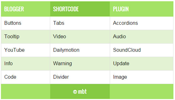
List of Blogger Shortcodes


Need Help?


If you need any further help do let us know. You can also join our 24/7 Free help and support forum to ask for further technical assistance.


Blogger shortcode Plugin have been our biggest contribution to Blogspot blogs. We hope to bring and introduce more such amazing plugins and tools to make your blogging journey worthwhile. Peace and blessings buddies! =)


Tuesday 26 May 2015

How To Safely Hide AdSense Ads using "Display:none" ?

hide Adsense ads using "display none"AdSense new policy allows publishers to only hide Responsive Ads using CSS media queries. You can choose to control the display of your Ad visibility on different mobile devices. You can now choose when to show or hide an ad unit. All these is now possible thanks to the Responsive Ad units. We recently shared a tutorial on how to create responsive ad spots and how to stop AdSense from serving blank space on Responsive ad units by fixing the blank space error. Today we will take a step ahead and share the trick of hiding AdSense Ads  on any screen size you want using simply CSS "Display:none" property.  Note that Google only allows you to hide the content using the CSS property of display and it does not yet allow using "visibility:hidden" property so we will only follow techniques which goes in accordance with AdSense Program policies. Sites which are hiding the AD code using "visibility hidden" are surely not following recommended methods and pose a serious thread to your accounts so always follow authentic methods to manage your monetization strategies.

In this tutorial we will share how you can set a parameter with CSS media queries for smaller mobile devices so that no ad request is made and no ad is shown. We have applied it on our blog and have set ads not to display on small screens.

Isn't it illegal To Hide AdSense Ads?

Yes it is but only for synchronous ads but not for asynchronous which is the new code AdSense creates to render responsive ads on your blogger blog or website.

The official support site of Google says that it allows publishers to modify the Ad by hiding it using CSS3 Media queries for responsive Ad units (asynchronous) only but it disallows it for synchronous ads. Here is the block quote for verification:

Techniques to avoid

Here are some techniques you�ll want to avoid:

  • Hiding ad units at anytime (e.g., display:none), unless you're implementing a responsive ad unit.
  • Implementing AdSense ad code in a way that covers content
  • Using any means to force the display of more than three AdSense ad units on a page
  • Manipulating the ad targeting using hidden keywords, IFRAMEs, or any other method
  • Distributing ads in emails or software
  • Floating ads or units that slide to attract unwarranted attention

Google has suggested itself the technique of using display:none on one of its support page

If you want to only show ads for certain screen sizes you can use CSS to accomplish this. The following example shows you how to modify your ad code to use CSS3 media queries to hide ads for specific screen sizes..

Now when we have learnt that the method of using CSS display:none is completely Safe, allowed and legal, we can then proceed towards our tutorial.

Hide AdSense Responsive ADs

I assume that you have read our tutorial on creating responsive ad units, if not kindly read it first

You just need to make a slight modification to the CSS code of your ad code and mention on which Screen Size would you like to hide displaying ads. All code is same that we shared earlier except the yellow highlighted section

<style type="text/css">
.adslot_1 { max-width: 300px; height: auto; margin:10px 0px; }

@media (max-width:99px) { .adslot_1 { display:none; } }

@media (min-width:100px) { .adslot_1 { width:125px; height:125px; } }
@media (min-width:180px) { .adslot_1 { width:180px; height:150px; } }
@media (min-width:200px) { .adslot_1 { width:200px; height:200px; } }
@media (min-width:250px) { .adslot_1 { width:250px; height:250px; } }
@media (min-width:300px) { .adslot_1 { width:300px; height:600px; } }
@media (min-width:336px) { .adslot_1 { width:336px; height:280px; } }
@media (min-width:468px) { .adslot_1 { width:468px; height:60px; } }
@media (min-width:728px) { .adslot_1 { width:728px; height:90px; } }

</style>

<script async src="//pagead2.googlesyndication.com/pagead/js/adsbygoogle.js"></script>
<ins class="adsbygoogle adslot_1"
     style="display:inline-block;"
     data-ad-client="xxxxxxx"
     data-ad-slot="xxxxxx"></ins>
<script>
(adsbygoogle = window.adsbygoogle || []).push({});
</script>


The above code has no changes except the yellow highlighted section where I have set ads not to display for screen sizes less than 99px. For sizes greater than 99px, ads will display normally. I have chosen 99px because normally all smart phones today have a wider screen size and day by day screen sizes are getting bigger except for some old sets which have an extremely small size and it makes no sense displaying ads on smaller screen sizes.

Hiding them will block the ad from rendering and loading. The JavaScript will not load this time unlike in synchronous where the JS still loads despite setting display:none. This is one extra benefit of using async codes. So you are not actually setting Ads to not show or disappear you are actually telling AdSense not to load Ads for a specific screen size.

You can also set a custom width to hide ads on a specific screen size. Suppose you wish to Hide ADs on a screen size between 250px but wish to display it for other screen sizes  so you will edit the code as shown below

PS: I am just sharing the CSS code here for simplicity:

<style type="text/css">
.adslot_1 { max-width: 300px; height: auto; margin:10px 0px; }

@media (min-width:100px) { .adslot_1 { width:125px; height:125px; display:block; } }
@media (min-width:180px) { .adslot_1 { width:180px; height:150px; display:block; } }
@media (min-width:200px) { .adslot_1 { width:200px; height:200px; display:block; } }
@media (max-width:250px) { .adslot_1 { display:none; } }
@media (min-width:300px) { .adslot_1 { width:300px; height:600px; } }
@media (min-width:336px) { .adslot_1 { width:336px; height:280px; } }
@media (min-width:468px) { .adslot_1 { width:468px; height:60px; } }
@media (min-width:728px) { .adslot_1 { width:728px; height:90px; } }

</style>

The code above will hide ads for a screen size 250px or less than 250px but will show ads for 200px, 180px and 100px or for screen sizes greater than 250px.

Note that we are using max-width to hide ads and not min-width condition. This is important because Ads are hidden and no AD request is made only when you use the max-width condition.

That's it!

Need Help?

Hope this tutorial may help you understand how to better control the display of Ads on your web pages. I am open for as many questions as you may wish to ask. Feel free to post your queries in the comment box below.

Peace and blessings buddies! =)
Saturday 23 May 2015

AdSense Responsive Ad Units Showing Blank Space in Blogger - [Fix]

Adsense Ads show blank spaceIt is almost a year since Google introduced Responsive Ad units for Mobile friendly weblogs and sites. Previously the Ads were synchronous which had a fixed ad size and were slow too in loading but now all responsive Ad units are  asynchronous in nature which means they will render and load seamlessly without effecting other elements from loading on your web page, this immensely reduces your blog load time.  One of the problems linked with Responsive Ad units is that most bloggers found it difficult displaying the async code on their blogspot blogs. For many users the responsive Ad unit shows a blank space or gives an error on browser console.
Many blogspot users contacted us how we managed to show responsive ad units on all our sites So today we will share the solution that will help you display responsive AdSense Ads in Blogger that is the only Fix to avoid the vacant space issue  (no Ad being displayed) and you will also learn how to hide AdSense ads using the display:none property which is now amazingly allowed only for asynchronous ads by Google.

Update : Safely Hide AdSense Ads using "Display:none"

DEMO: All Ads that you see on this blog are Responsive. Due to Low CTR we have reverted back to Synchronous
Tutorial Series
3. Hiding Widgets & Scripts in Mobile Templates [1], [2]
6. Create Mobile Responsive AdSense Ads and Safely Hide AdSense units
7. Make Blog Sections Responsive: Header Widgets, Posts + Sidebar, Footer

Why Should You use Responsive Ad Units?

Just like how a Responsive web design allows you to dynamically control the presentation of your webpage according to the properties of the screen size that it�s being viewed on similarly a responsive ad unit allows you to control the ad size on your page. You can choose which Ad size to display on your iPhone, Samsung, Tablet or iPad. You can also decide when to display ads and when to hide it for small screen devices.

Following are reasons why you should use responsive units

  1. Your Ads load asynchronously, thus making your page load faster as opposed to the Old Adsense Code which slows down web page loading.
  2. Automatic sizing based on the space available, shows high resolution ads to your visitors thus increasing overall CTR. Your ads will not look chopped or cut from edges on small screens.
  3. You can now Hide Ads! Google now allows users to use the display:none CSS property to hide Ad units. This is only allowed for responsive units.
  4. Mobilegeddon Penalty punishes sites that are not mobile friendly and which do not load fast. Responsive Ad units makes your ads fluid and flexible and make pages load faster, thus providing the best user interface.

The only drawback is that Adsense responsive Ads do not change size on device orientation unless page is reloaded. So same ad will be displayed in both landscape and portrait view when the user rotates the device without page reloading.

Why Do you See a Blank Space?

If you are seeing a blank space or empty Ad spot with no ad being displayed then you are probably making one of these mistakes:

Popular Reasons

  1. The Parent container has no width set: Async Ad code won�t load if you have not mentioned a width to the container where you placed the ad. You must define a class for your Ad code to control its display using CSS Media Queries.
  2. You didn't remove the data-ad-format tag: You will see the following error on your browser console when you forget to mention a width to the Ad container or when you have not removed the smart-sizing tag i.e. data-ad-format="auto" This tag is the major reasons for Ad not being displayed. Google need to work on it to make it work better.

    responsive-ad-size-console-error

  3. If ads are displaying fine on your sidebar widgets but not working inside blogger template then the only reason this is happening could be that you did not encode the HTML code correctly. We will discuss below how to do it.

Less Popular Reason

Your site uses third-party JavaScript: If you are using scripts to hide ads until all page content have loaded then Async Ad code won't load because it will not be able to calculate the required size for the responsive ad unit.

In both these cases, you will see a blank space and no Ad being displayed. We will guide you how to fix the first reason and for the 3rd-Party JavaScript thing, I am sure this does not apply to most users because rarely would anyone use such a script. So lets go straight to the solution!

Create a Responsive Ad Unit

Note: The method described below abides by the Google AdSense Program Policy rules and is safe and tested.

You will Create an ad unit in the usual way:

  1. Go To your Adsense Account
  2. Click My Ads tab
  3. Click "New Ad unit"
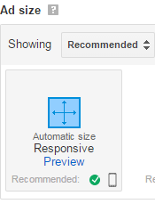
  4. Choose �Responsive� from the Ad size options
  5. Fill other details and click Save and get code.

select responsive Ad size


Your code will look quite similar to this:

<script async src="//pagead2.googlesyndication.com/pagead/js/adsbygoogle.js"></script>
<ins class="adsbygoogle"
     style="display:block"
     data-ad-client="ca-pub-5679872456940800"
     data-ad-slot="4890310675"
     data-ad-format="auto"></ins>
<script>
(adsbygoogle = window.adsbygoogle || []).push({});
</script>

From the above code you just need your data-ad-client alpha-numeric code and your data-ad-slot numeric code as shown bolded in the code above. Copy these two codes from the Adsense code you generated and keep them safe inside a notepad because we will need them later.

Add Responsive Ad Units inside Blogger Widgets

If you wish to add AdSense Content unit inside a widget on your sidebar then follow these steps:

1. Go To Blogger > Layout

2. Click "Add a Gadget"

3. Select "HTML/JavaScript" Widget

4. Paste the following code inside it

<style type="text/css">
.adslot_1 { max-width: 300px; height: auto; margin:10px 0px; }

@media (min-width:100px) { .adslot_1 { width:125px; height:125px; } }
@media (min-width:180px) { .adslot_1 { width:180px; height:150px; } }
@media (min-width:200px) { .adslot_1 { width:200px; height:200px; } }
@media (min-width:250px) { .adslot_1 { width:250px; height:250px; } }
@media (min-width:300px) { .adslot_1 { width:300px; height:600px; } }
@media (min-width:336px) { .adslot_1 { width:336px; height:280px; } }
@media (min-width:468px) { .adslot_1 { width:468px; height:60px; } }
@media (min-width:728px) { .adslot_1 { width:728px; height:90px; } }

</style>

<script async src="//pagead2.googlesyndication.com/pagead/js/adsbygoogle.js"></script>
<ins class="adsbygoogle adslot_1"
     style="display:inline-block;"
     data-ad-client="xxxxxxx"
     data-ad-slot="xxxxxx"></ins>
<script>
(adsbygoogle = window.adsbygoogle || []).push({});
</script>

Make these changes:

  • Set 300px equal to your sidebar width. If your sidebar is 400px in size then set width to 400px. Suppose If you want to display ads on Footer or Header where you may even display large Leaderboard ads then you may set the width to 800px.
  • Replace xxxxxxx with the alpha-numeric code of Client ID that you saved inside a notepad.
  • Replace xxxxxx with the numeric code of your Ad slot that you saved inside a notepad.

5. Save your widget and you are all done!

The code above will display a Half Page Ad, Squares and Rectangles for small, medium and large sizes based on the Mobile Device Screen size.

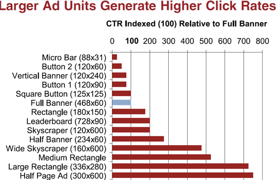
The above code will display best performing Adsense ads on your sidebar. I have assigned the best performing Larger Ad units to the code above to give a higher CTR. The table below shows how great larger ad units perform compared to smaller units.

best performing AdSense ad units

The above chart was shared by the AdSense optimization team in an online webinar.

Want to Add more Ad units?

If you want to add another Ad unit on your sidebar then you can use the same code as I shared above with a slight change.

  • You will replace adslot_1 with adslot_2 everywhere. To add a third unit replace adslot_1 with adslot_3 and so on..

Add Responsive Ad Units inside Blogger Template

To ad responsive Ads inside the blogger template you need to make a slight modification to the code above. We need to encode the JavaScript code which renders the ads. I have made all changes for you. You just need to use the code below instead:

<style type="text/css">
.adslot_1 { max-width: 300px; height: auto; margin:10px 0px; }

@media (min-width:100px) { .adslot_1 { width:125px; height:125px; } }
@media (min-width:180px) { .adslot_1 { width:180px; height:150px; } }
@media (min-width:200px) { .adslot_1 { width:200px; height:200px; } }
@media (min-width:250px) { .adslot_1 { width:250px; height:250px; } }
@media (min-width:300px) { .adslot_1 { width:300px; height:600px; } }
@media (min-width:336px) { .adslot_1 { width:336px; height:280px; } }
@media (min-width:468px) { .adslot_1 { width:468px; height:60px; } }
@media (min-width:728px) { .adslot_1 { width:728px; height:90px; } }

</style>
&lt;script async src=&quot;//pagead2.googlesyndication.com/pagead/js/adsbygoogle.js&quot;&gt;&lt;/script&gt;

<ins class="adsbygoogle adslot_1"
     style="display:inline-block;"
     data-ad-client="xxxxxxx"
     data-ad-slot="xxxxxx"></ins>
<script>
(adsbygoogle = window.adsbygoogle || []).push({});
</script>

The yellow highlighted region shows the encoded code. You will make same changes to the above code as you did for the sidebar. No extra steps involved here. Simply copy the code, make changes as guided and start enjoying a better Mobile revenue thanks to Google Adsense Responsive Ads!

See them in action!

The ad in the footer of this blog is responsive so I am sharing some screenshots from iPhone devices to show how the ads auto adjusts itself based on device screen size.

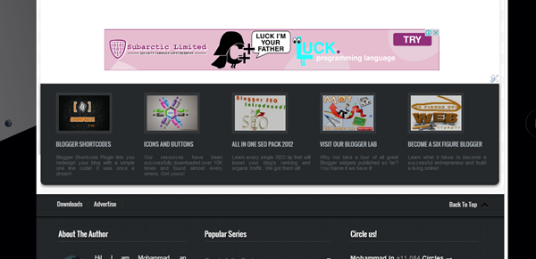
Actual size on laptops and Tablets (728 X 90 Ad Size)

Adsense ads on ipad mini


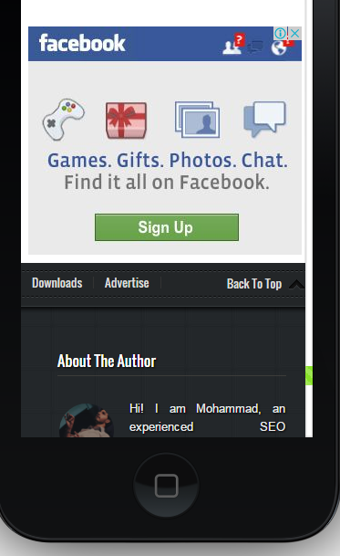
iPhone Portrait view  (300 X 250 Ad Size)

Adsense ads in portrait view


iPhone Landscape view (468 x 60 Ad size)

Adsense ads in landscape view

Need Help?

This is the first and only tutorial which guides you properly on how to setup Responsive Ads on blogspot blogs, if you need any help or further assistance then please feel free to let us know by posting your question in the comment box below or by joining our 24/7 Free Help forum.

In our next tutorial, we will discuss how to use display:none property to hide Adsense on small screen devices. Till then do experiment with the code above and do let us know your feedback. Peace and blessings buddies! =)

Wednesday 20 May 2015

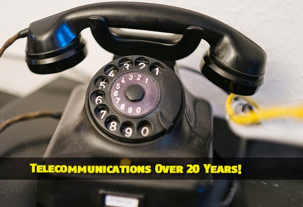
How Telecommunications Have Changed Over The Past 20 Years?


growth of telecommunications


With rapid changes in Google's algorithm for mobile devices and the boom in mobile telecommunication, we thought why not share some historical background to give our readers some highlights of some of the biggest changes in Mobile technology specifically Telecommunication Industry because internet and of course blogging would have been never possible without the advent of telecommunication. 


The development of electronic telecommunications goes back as far as the early nineteenth century and the telegram, while the first commercial telephone service was established in 1878. The twentieth century saw the development of radio and television and by the 1970s the precursor to today's internet was already established.

After Motorola's demonstration of the first handheld cell phone in 1973, the internet and cell phones as we know them would become widely adopted by the public during the 1990s, and arguably the past 20 years have seen the most far-reaching and dramatic revolution in telecommunications since the original invention of the telephone. Moreover, this pace of change and development shows no sign of slowing down.


The growth of the internet 


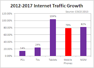
internet traffic growth


The World Wide Web and the HTTP protocol were invented in 1989, and revolutionized communication over the internet when they were made available to the public in 1994. While email predated the internet, in 1996 Hotmail launched the first web-based email accounts, meaning you could now access your messages on any web-connected computer, which led to the growth of internet cafes around the globe for backpackers and tourists. The same year the first Instant Messaging service was launched, and the late nineties saw the launch of familiar names like Amazon, Ebay and Google. 


Social media 


social media trend


The advent of 'Web 2.0' in the early 2000s allowed ordinary internet users to take control of the medium and to use it as a platform for their own creativity and communication. Web 2.0 applications included blogging, YouTube, Myspace, LinkedIn and Twitter. In 2006, Facebook expanded from universities to anyone with a valid email address and would soon become the definitive social media network, transforming communications and relationships around the world. In 2011 social media was used to organize protests in Egypt, resulting in sites being shut down by the government. 


Mobile phones 


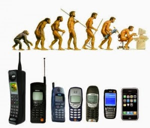
mobile phone evolution


Mobile cell phones gradually became more widespread and sophisticated throughout the late nineties and early 2000s. 2007 saw Apple's first iPhone appear; the smartphone era was upon us, liberating internet connection from the desktop. The advantage of the smartphone is most apparent in developing countries, where previously isolated people are able to not only communicate with family and friends over long distance, but are able to connect with the web and a whole world of cultural and commercial possibilities.


Smartphones


The telecommunications network in the Middle East was slower to develop than in many western countries, but is now experiencing something of a boom. Afghan Wireless modernized Afghanistan's outdated telecommunications sector and launched the country's first mobile phone network in 2002. Founder Ehsanollah Bayat also established Ariana radio and television which now reaches an audience of millions in Afghanistan and beyond. Look at Ehsanollah Bayat on XING to find out more. 


The future of telecommunications will come in the form of billions of new smartphone users, and most of them will be in Africa, Asia and the Middle East. As the technology becomes cheaper and faster they will use their phones not just to keep in touch but to connect with the commercial world and to improve their fortunes. The telecommunications revolution isn't over yet.


Tell us what you Know!


Let us know what you know about telecommunication and how it has changed your life over a decade? I hope this interesting info may help you better understand how life changed with changes in Telecommunication systems. :)


Tuesday 19 May 2015

Create Shortcode For CSS3 Tooltip in Blogger!

shortcode for CSS3 TooltipCSS3 Tooltips are Fancy balloons or boxes that are used to show your blog readers some extra information on mouse hover. They can be used in different ways for example, to provide captions for images, or longer descriptions for hyperlinks, or any useful info by simply hovering over the element containing the tooltip class. Thanks to Blogger Shortcode Plugin now you can create colorful animated Tooltips to enhance your blogspot user interface. This new Shortcode for Tooltip will help you display balloons at top or bottom of your hyperlinks on mouse hover. You can add them inside your blog posts, widgets and even inside your blog comments! You will also be able to display Images inside the tooltip box and display a custom message using HTML. See the demo first!

1. Install Blogger Shortcode Plugin

In order to use Tooltip shortcode you must first install the shortcode plugin for your blogspot blog by following 7 easy steps shared on the link below:

Skip installing it if you have already added it in your blogspot template

2. Add ToolTip Color Theme Skins

I have created two theme skins for the tooltips. One is yellow and second is with black background. You can customize the tooltip background colors as per your choice by following the instructions below:

1 Go To Blogger > Template > Backup your Template

2 Click "Edit HTML"

3 Search for this code ]]></b:skin>

4 Paste the following Code just above it


/*------ CSS3 Tooltip Shortcode -------------*/
.tooltip{outline:none;text-decoration:none!important;border-bottom:2px dotted #0080ff;position:relative}.tooltip:hover {border-bottom: none;}.tooltip strong{line-height:30px}.tooltip > span{max-width:300px;width:290px;padding:10px 20px;opacity:0;bottom:170%;margin-left:-120px;visibility:hidden;z-index:10;position:absolute;font-family:Arial;font-size:12px;font-style:normal;border-radius:2px;box-shadow:2px 2px 5px #999;-webkit-transition-property:opacity,margin-top,visibility,margin-left;-webkit-transition-duration:0.4s,0.3s,0.4s,.3s;-webkit-transition-timing-function:ease-in-out,ease-in-out,ease-in-out,ease-in-out;transition-property:opacity,margin-top,visibility,margin-left;transition-duration:0.4s,0.3s,0.4s,.3s;transition-timing-function:ease-in-out,ease-in-out,ease-in-out,ease-in-out}.tooltip > span img{float:right;width:110px;margin:0 0 30px 10px;padding: 0;border: none;}.tooltip:hover > span{opacity:1;text-decoration:none;visibility:visible;overflow:visible;display:inline;margin-left:-90px}.tooltip span b{width:15px;height:15px;margin-left:20px;bottom:-9px;display:block;position:absolute;-webkit-transform:rotate(-45deg);-moz-transform:rotate(-45deg);-o-transform:rotate(-45deg);transform:rotate(-45deg);display:none\0/;*display:none}.tooltip > span{color:#fff;background:#222222 url(http://test.stcnetwork.org/wp-content/themes/swag/assets/images/patterns/overlay2-20.png);border:1px solid #ffffff}.tooltip span b{background:#222222 url(http://test.stcnetwork.org/wp-content/themes/swag/assets/images/patterns/overlay2-20.png);border-bottom:1px solid #ffffff;border-left:1px solid #ffffff} .tooltip:before {content: "\f05a";font-family: FontAwesome;padding:0px 5px;}
 
/*
.tooltip > span{background:orange;border:1px solid #ff0}.tooltip span b{margin-top:-19px;top:10px;background:orange;border-top:1px solid #ff0;border-right:1px solid #ff0;border-bottom:1px solid orange;border-left:1px solid orange}

*/

Make these Customizations if you want:

By Default the tooltip background is black and it pops up at the top of the hyperlink. If you want to display the tooltip at the bottom of the link instead then make this simple change to the CSS code above:

yellow theme tooltip

  • Replace bottom with Top
  • Remove the yellow highlighted symbols /*   and this */
  • To change the orange background replace orange with a color of your choice or its hexadecimal code. Replace it 4 times
  • To change the border color of the orange tooltip replace ff0 with a hexadecimal color code of your choice. Replace it 3 times

Tip: Use our Color Code Generator to pick colors of your choice.

If you like to change background colors of the black tooltip then follow these steps:

black theme for tooltip

  • To change the black background replace 222222  with the hexadecimal color code of your choice.
  • To change the border color replace ffffff with your prefered hexadecimal color code
  • To change the color of the dotted underline that appears below link then replace 0080ff with your color code.

5 Save your template and all done!

Finally add Tooltips Shortcode

Now whenever you wish to add some information to a link then use the shortcode in this format

[tooltip url="ADD LINK HERE" title="ADD TITLE HERE"]Add HTML Text Here[/tooltip]

Lets create a simple tooltip with title "Blogger Shortcode Plugin"  as shown below:

[tooltip url="http://www.mybloggertricks.com/2015/04/blogger-shortcode-plugin.html" title="Blogger Shortcode Plugin"]
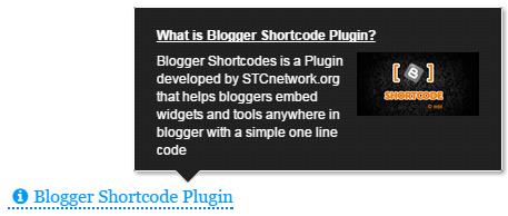
Blogger Shortcodes is a Plugin developed by STCnetwork.org that helps bloggers embed widgets and tools anywhere in blogger with
a simple one line code

[/tooltip]


OUTPUT:

Tooltip with Text


Now lets create a tooltip which contains a header, some description and an image. You will create the shortcode in this format:

[tooltip url="http://www.mybloggertricks.com/2015/04/blogger-shortcode-plugin.html" title="Blogger Shortcode Plugin"]
<strong><u>What is Blogger Shortcode Plugin?</u></strong><br/>
<img src="http://lh6.ggpht.com/-oPBnxfpw5i0/VR5qysG9f8I/AAAAAAAAOmA/Fli69O0Ne2s/image%25255B51%25255D.png?imgmax=800">
Blogger Shortcodes is a Plugin developed by STCnetwork.org that helps bloggers embed widgets and tools anywhere in blogger with
a simple one line code

[/tooltip]

You can insert any html (except a hyperlink) inside the tooltips square braces.

OUTPUT:

Tooltip with image and headline

That's it! Have fun adding any stuff to the tooltip box :)

Update: An info Icon has been added that will prompt readers that the link contains some info.

Need Help?

This shortcode was developed based on the User request posted by Shivansh on our forum. You can also request us to create a shortcode of your choice.

Do let us know if you need any help if needed. I hope this new shortcode may add a new life to your blogspot blogs. Peace and blessings buddies! =)

Sunday 17 May 2015

Google Phantom - Worst Google Penalty Ever For Bloggers!


Google Phantom Update


According to unconfirmed reports, Google is rolling out a new algorithm update for its search results. Dubbed as "phantom" - named after its ghost-like appearance - this new update is primarily impacting tutorial and "how-to" content. A significant number of large and important websites have seen a significant drop in traffic over the past couple of weeks. Since Bloggers are first to write HowTO tutorials, this penalty is the worst of its form and will massively effect traffic of blogs which are involved in tutorial writing. So what is this update and is it significant?


HubPages is a large collection of almost a million mini-blogs containing informational content about a wide variety of topics. Since May 3, it has seen its Google search traffic drop by 22 percent within a week. Websites like eHow, WikiHow, and Answers.com are other sites that have seen significant drops in traffic over the past couple of weeks.


Although Google has not yet acknowledged this update, experts believe that this update is not related to Panda or Penguin. However, similar types of �thin� content targeted by Panda are also being targeted by this update. Sites with an abundance supplementary information, pages of stacked videos, and pages difficult to navigate have all lost visibility in recent weeks.


This update is said to be �ruthless� in its approach - apparently having no problem punishing entire domains for a few instances of thin content.


�When you have a domain-level algorithm update or ranking change, it can impact the whole site� Pages that should be drawing well could also be pulled down in the results.�


Google has not formally commented on this update, although at SMX Sydney this week Gary Illyes, from Google�s Webmaster Trends team, alluded to there being a recent change that�s part of a core algorithm update.


With Google�s Knowledge Graph being notorious for detracting traffic from sites for �how to� searches, coupled with this �Phantom� update, being a content publisher is more challenging than ever. Experts admits to not being able to predict what business will look like tomorrow, next week, next month, etc.


Have you noticed a significant change in your traffic since the beginning of May? If so, what types of content do you believe was targeted? Let us know in the comments section below!

Wednesday 13 May 2015

"Head Office" of a Professional Blogger

Office of a Blogger :)

Today we are not changing the world and neither claim to revolutionize the web but yes we have changed our mini world and revolutionized our workspace and changing the perception of all parents that our motto of "Transforming Bloggers Into Entrepreneurs" was never just a sugar coated slogan, we meant it and we are proving it today! STCnetwork has transformed from a simple Home ran business to a Commercial Open Market Business. We are officially launching the first Head Office of STCnetwork in Karachi, which is the First Registered Company in subcontinent of Professional Bloggers, which aims at promoting Online Entrepreneurship across the country and globe. This office is Alhamdulillah a successful execution of Phase I of our Mega Plan and with God as the Mentor and our readers as a source of motivation, we are very close to Phase II. Our employees work virtually from different countries and cities and we do make up a good family.

What is the Office all about?

We have been educating over thousands of students, house wives, retirees and jobless on daily basis since consecutive 5 years across the globe and have fortunately transformed several students into Content Writers, SEO geeks, Pro Bloggers, Web developers and Programmers. Today this office is a clear evidence of how correct online earning strategies and hard work can guarantee you a substantial and lucrative income online.

From this month onwards we will be offering web services and web solutions to local clients too and have expanded our development scope to Mobile applications also. Our services and area of interest include:

  • Web development
  • App Development
  • Graphics and Animation
  • SEO Auditing & Consultancy
  • Web marketing Campaigns and SEM
  • Online Business Strategies and ideas
  • *Preaching Entrepreneurship through Public Speaking

With this Office we hope to better help our clients and students who are eager to learn more about content writing and online earning mechanisms. Loyal clients and readers would be able to meet us face to face and have a cup of Green Tea with us!

For The Record

Professional bloggers have mostly Home Offices but we needed to step ahead of all and become amongst the pioneers to step into open market as Bloggers and web developers.  To our best knowledge STCnetwork is currently the First Registered Company of Professional Bloggers with a Commercial Office in South Asia and we pay regular income tax and have our company NTN (National TAX Number).

What made it Possible?

I never forget the old days because they keep me reminded of who am I and what have I become and what I need to do next. My parents belonged to a middle class family and they worked day and night so that I could be an educated gentlemen. It is hard explaining every detail of how a small school going guy turned into an entrepreneur today in a field of blogging which was rarely practiced in my country and rarely do anyone knew about it but if there is anything that helped me reach this stage is certainly trust in God, helping people, respect of readers, remaining humble to mentors and consistent hard work despite several ups and downs. Maintaining an online business is tough when you have a bully like Google around =d but it is only patience and dedication that enables you to face it all and still be happy and contended with life.

A saying of the Legendary boxer Muhammad Ali is enough to describe why I always emphasize so much on hard work:

I hated every minute of training, but I said "Don't quit, suffer now and live the rest of your life as a champion"

It isn't the mountains ahead to climb that wear you out;
it's the pebble in your shoe

Impossible is just a big word thrown around by small men who find it easier to live in the world they have been given than to explore the power they have to change it, impossible is not a fact, it's an opinion,
impossible is not a declaration, it's a dare, impossible is
potential, impossible is temporary,

impossible is nothing.

Surely no success is possible without hard work. Hard work is the only requirement that pleases God irrespective of which religion or belief you follow, whether you are a Muslim, Hindu, Christian or Jew, God blesses almost anyone who steps ahead to bring about a positive change. Striving day and night is the necessity to live for a strong purpose in life, without hard work you have no purpose.

Why was there a need for an Office?

Working from home is really difficult if you are married because the surrounding around you is full of distraction. After my marriage I found it quite difficult to manage work and family responsibilities. You need some peace of mind where you could explore your creativity and be more productive. Therefore I decided to step out and establish an Office which would be a great source of meet up place for Local bloggers and also a source of motivation for newbies.

I also have a Plan B in mind which is sort of a bigger picture and so far this Head Office was the fundamental requirement and Phase I of the Phase II

Office Interior Design

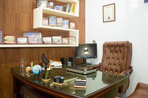
It took me around 20 days to design the interior of Office Space, decorate it with Office accessories like furniture, tool kit, Computer system, Wi-Fi Internet connection and furnish the environment the best I could with soft and pleasing colors, tiling and paint. I hope you like it. See it for yourselves!

Old Home Office and the Distraction!

A 3 years Old Pic of our home office.

STCnetwork Home Office

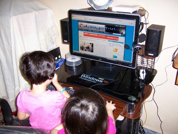
Can anyone work in this environment? These little cute monsters would snatch away my Mobile phone, Flash Disks and what not! They would conquer the computer system and would rarely let me touch it unless they have qualified the Game level! ;(

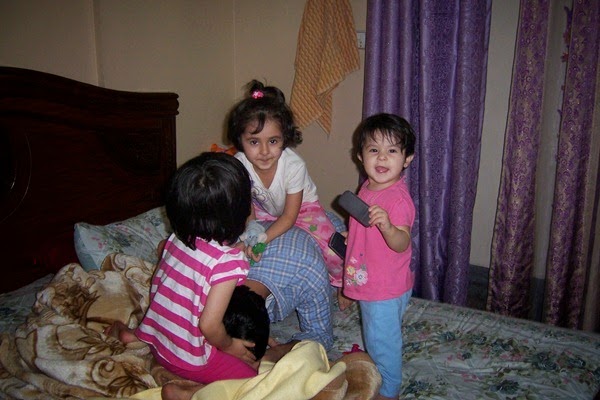
My Little nieces

New Head Office

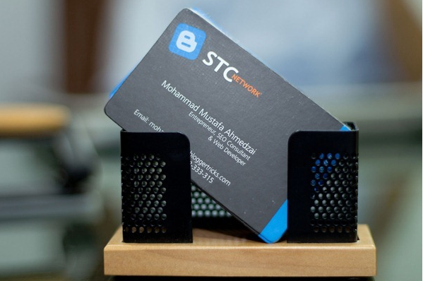
STCnetwork Visiting Cards

Pens and Markers Kit

Photo showcase

Notice Papers

Showcase

I blog for living!

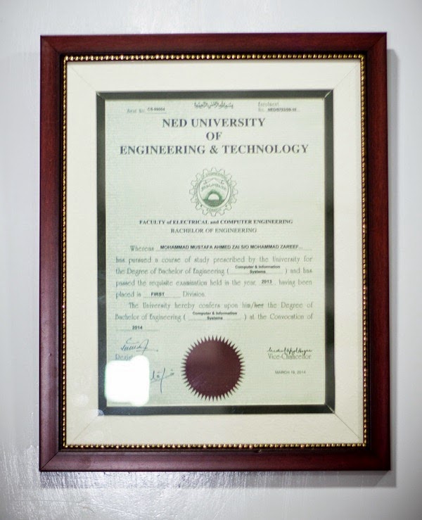
Computer Engineering Degree

STCnetwork frosted on Glass!

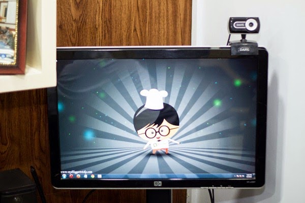
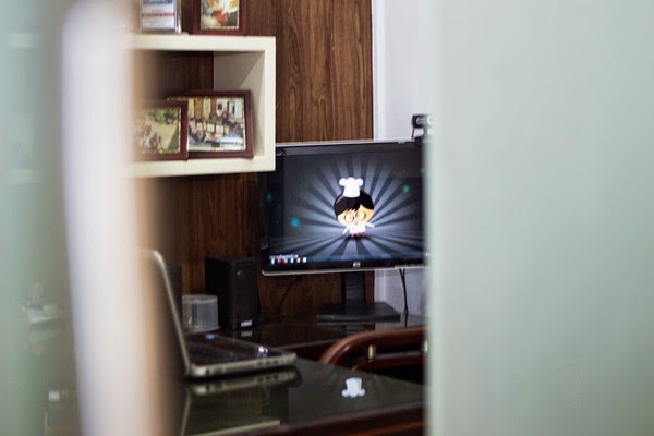
Cheff Looney!  Our Avatar!

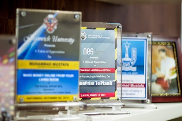
Shields and Awards

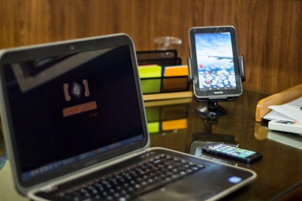
Tech Gadgets

A Blogger's Office in One Look!

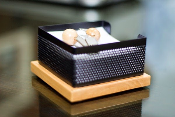
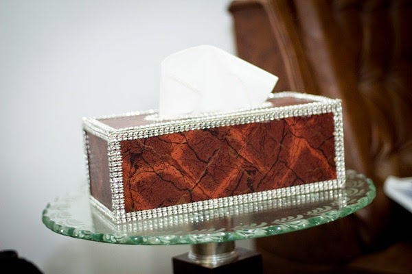
Tissue Box!

Office Exterior - STCnetwork

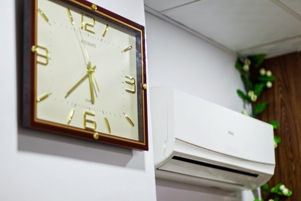
On The Time Always!

Sneak Peek!

Era of Mobile Responsiveness


Photo Credits goes to one of my dearest buddies Asjad Azeem (Photographer and Software Engineer at Techlogix). I am extremely thankful to him for taking out time and capturing the office snapshots.

5 years old pic with Asjad :)

Company Website!

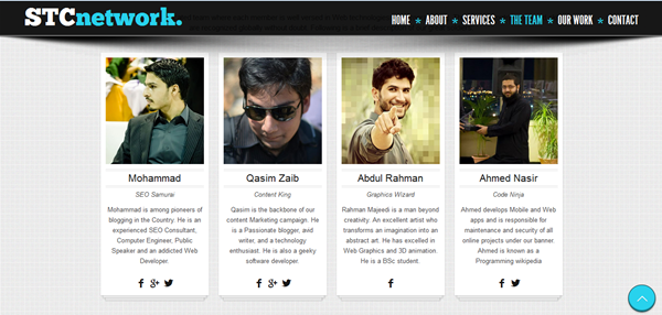
STCnetwork.org has been completely redesigned and equipped with all details. It is build on HTML5 and PHP with parallax effect. We will release it within few days. See a glimpse of it below:

STCnetwork Landing Page

STCnetwork team

The team list also includes our senior most Content Writer and Marketing Queen Nida Zaidi.

Head Office Location - Come Have Tea with us!

We don't drink coffee nor beverages but yes we are a big fan of Green Tea (our cultural drink =p ) and we would love to have a cup of it with you when you visit us!

=====================================

Main Shaheed -e- Millat Road,
Near Dubai Islamic Bank,
Silk Mall, 1st Floor, F-17
STCnetwork
Karachi, Pakistan
Email: mohammad@mybloggertricks.com

=====================================


Visitor Reviews

I invited some of my best mates to the office on the opening ceremony and here is what they have to say when I asked them for a review:

wassay khan

@Wassay Khan ~ iOS Developer at netspace

A great achievement in his career, never thought that he would achieve such kind of greatness so early in life.
Hope and Pray that you achieve your desired goal as always. =d


Ahmed Nasir


 @Ahmed Nasir ~ The Best Programmer ever

As I stepped in I felt I was inside a judge's chamber! MashAllah everything was professionally setup and well decorated. I wish you all the best and may Allah succeed you even more!  =)


Umair Ahmed khan

@Umair Ahmed Khan ~ Software Engineer at VentureDive

It was truly an awesome experience... Everything was perfect on its place. This is just the start of the journey, you will be having your own empire named STC Network inshAllah. I know you will also remember me then as well. Best of luck buddy for your Soon To Come Future :-)


Muhammad Haris

 @Muhammad Haris ~ Software Engineer at VentureDive

The first thing that came to my eyes when I entered the office is the frosted logo on Glass of STC, MashAllah. Everything was so well decorated, loved the theme a lot. Everything from dustbin to Office table was theme aligned. I see this roller coaster is moving to its peak inshAllah. May you have many more success in your business and life. Ameen :)

Ramesh Kumar Khatri

 @Ramesh Kumar Khatri ~ Mobile App Develop at NextGeni

STC's baby Office is so cute, it smiles at you with attractive color combination and embraces you with that wooden frame fixed on wall. At first I found it good but when I stepped in and spend some time, I found it amazing! Hope this baby Office (as you named it) grows well and healthy! :>


Muhammad Ahsan Marfani

@Muhammad Ahsan Marfani ~ Management Executive at National Refinery Ltd.

A Space of approx. 80 square feet. Equipped with every essential item increasing your efficiency manifold as compared to work from home. Exclusively styled giving a touch of executives class. In a nutshell a nest every blogger can only dream.

Your views and Reviews!

I can barely sleep peacefully unless I have shared everything with my family online and I could have rarely even dreamt of all that we achieved so far if we were not supported and motivated by the kind online community of blogosphere and MBT readers. I hope this story of a small man may motivate youngsters to step into Online entrepreneurship and give as much importance to Creativity and self development as they give to Higher education. May you guys have the best of life and be far better entrepreneurs and ambassadors of your life. The future is all about you guys, you just need to keep your trust in God and yourself. Laziness pays off now but hard work has a future payoff so keep working harder and wait for the pleasant hidden surprises that awaits you!

Do not forget to post your reviews and share your precious feedback. Your every word means a lot!Peace and blessings buddies! =>